
A landing page’s objective is to nourish prospective consumers who aren’t yet prepared to make a purchase and to show how your business offers a specific benefit in that field. Such a website is crucial if you want to increase customer satisfaction, increase sales of your product or service, and attract new clients quickly with alluring offers.
You’ll discover the essential elements of a fantastic B2C and B2B landing page in this blog and how to incorporate them into your content to boost conversions.
How do landing pages work?
- A landing page is a standalone web page that has been designed with a specific goal in mind. You can set tracking parameters on a landing page to monitor user behaviour. Most landing pages serve one of the following five objectives:
- Motivate a visitor to press (to visit a different page, either on your own or another site).
- entice a visitor to buy something.
- Encourage a visitor to grant you permission to contact them again (by email, phone, etc.).
- Get a customer to recommend your goods or services to a friend.
- Encourage visitors to leave feedback or learn something. You could do this by leaving a comment or rating one of your goods or services.
Potential customers are demonstrating interest in the particular business model or item when they click on your landing page via organic search, PPC ads, social ads, or promotional emails. Nevertheless, a landing page alone won’t be sufficient to encourage a purchase.
You can arrange the content in certain ways to promote configurations and ultimately sales. Here are five best practises to follow in order to create landing pages that draw in more visitors and magnify their investment signals.
1. Create a catchy headline
Your landing page’s headline is the first thing a user sees, and the majority of people will read it before skimming the copy. Therefore, it’s crucial to craft catchy headlines.
To achieve that, stay away from headlines that are unclear or inaccurately summarise your content. First and foremost, make sure your content is presented in an interesting, succinct, and eye-catching manner. Second, make sure the benefits of your offer are clearly stated in the headline. Users will be more likely to stay on the page and respond to the call to action if this happens.
Thirdly, remember that an optimised page title (which incorporates a keyword you are targeting) can also assist in improving your search engine ranking (check out this guide to YouTube SEO and ranking for tips). A keyword-optimized landing page that is indexed on your website makes it more visible for that specific query.
For a seamless user experience, make sure your landing page’s headline always corresponds with the headline of your email, advertisement, SEO copy, etc.
2. Create unique landing pages for each running advertisement.
The information a user has clicked on must closely correspond to the title of the article and body copy on your landing page. It is described as “[…] trying to match the heading of your landing page with the title of the ad or snippet of marketing your viewer clicked.” This is known as a “message match.”
A wonderful user experience includes message matching. Furthermore, sending users to your homepage or a different product page from your promotional pages won’t enable that message to match up properly because most B2C businesses produce and distribute a lot of content across numerous categories and product types.
For instance, if you send an email promoting area concerts, including one in which they might be extremely keen, he or she may tap on your CTA button to purchase tickets for that performance. The user will likely be quite irritated if you direct him or her to your website’s homepage instead of the artist’s ticket page, which has promotional content for cricket tickets.
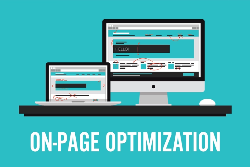
3. Employ images Carefully
When information is presented alongside pertinent images, 65% of people remember it, compared to only 10% of those who only hear it. As a result, it’s best to include an image that shows a person using your product or service or that shows the visitor what they will get if they convert to your landing page.
But take care. Always use images to increase conversions rather than divert site visitors. Your images should not only be motivational, distinctive, and arresting, but they should also be strategically placed to move the reader to take action. If you’d rather take that route, a brief instructional video can also help increase conversion rates. Plus, it’s simple to create excellent videos with the tools and software that are currently available.
Remember that using pictures of people can be particularly challenging. The subject(s) in these kinds of pictures should be looking in the direction of the call to action button. Based on the direction the baby is facing, take a look at the eye-tracking survey below.
Because we are social beings, it is in our nature to look where other people are looking. The path in which the baby was searching at the form is clearly the best one, as shown by the red area above, which shows how people interacted with it.
4. Create Powerful CTAs
The most crucial element of your landing page is your call-to-action (CTA) button because it’s how new leads are added to your database. Without this button, you won’t attract potential new customers, which diminishes the significance of the remaining copy and images on your page. Your conversion rate can go up by tens or even hundreds of percentage points when you use great CTAs, which include three essential components.
You must persuade visitors to click on the CTA button because they must feel compelled to do so. Focus on interesting, individualised copy instead of dull or unclear copy like “submit” or “get started,” such as “Send me the eBook” or “Get my free trial.”
Your button’s CTA colour should contrast with the items around it to get the most attention possible. To determine which colours are most effective for your company, use A/B testing. It’s important to avoid making assumptions based on “best practices” that might not apply to you because preferences can frequently vary by industry and persona. In light of this, it is generally advised to use colours for your CTA button that contrast with the colour of your page and any objects on it that are on the left side of the colour wheel shown below (green, blue, and purple) (s).
5. Don’t make your forms too complicated
Your conversion rates may be ruined by a badly designed contact forms. Prospective customers don’t want to devote a significant amount of time disclosing a lot of personal details only to take a deal. Don’t ask for more information than you absolutely need; users often voluntarily give more information once they become consumers.
Split testing, often known as A/B testing, compares two landing pages to evaluate which works better for your marketing. This can help with form design since it demonstrates how much data a customer is prepared to provide. A user may become disinterested if there are too many fields. To make your landing pages more effective, use our A/B testing toolbox.
Nowadays, a lot of businesses allow potential customers to fill out their details on their social media pages. Many busy shoppers will benefit greatly from this simple choice.
Best practise: Understand why first-party data is more crucial today than ever in a cookie less environment where data protection is a major topic.
Some advice for your landing pages
In order to increase the effectiveness of your landing pages, you should:
- Create headlines that are precise, simple, and appealing.
- Create a unique landing page for every running promotion. Make sure the wording and graphics in your email or advertisement clearly relate to the offers on the landing page.
- Be careful when using photos. Make sure they encourage conversions rather than discouraging your potential customers. Be sure that any images of individuals you use are facing the form you want potential customers to fill out.
- Create compelling CTAs with wording that motivates action, and pay close attention to your colour choices. Make sure the terminology you use is appropriate for each individual offer.
- Be sure you create forms that are straightforward to fill out, brief, and uncomplicated. Give users the opportunity to fill out the form using their Gmail or social network profiles.


One Response
Hi, this is a comment.
To get started with moderating, editing, and deleting comments, please visit the Comments screen in the dashboard.
Commenter avatars come from Gravatar.